I want to preface this by saying that this blog post is ABSOLUTELY not a dig at anyone in the marketing or design team. There are many (many!) more examples out there of covers that have been imitated, these were just the ones I came across easily on Amazon. AND although I’m picking a title that was the ‘originator’, keep in mind that there is nothing original under the sun, and there were many books that came before the book I have chosen. Also, please note that the links in this article are affiliate links, which means I earn tuppence ha’penny if you purchase something after clicking through. With that in mind…
The other day I was doing some bookstagram research for a title I’m working on, and I came across a photo that got me excited.
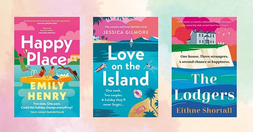
A new Emily Henry already!? I thought. I read Happy Place over May half term, surely she hasn’t got a new one out already!
It was not (although there is one coming next year).
It was this book, with a cover that is strikingly similar to Happy Place, and the look that the Penguin designers have nailed for the rest of the books in the UK. Then, as I was continuing my research, I came across this one, which was different, yet somehow the same. I’m sure there are others out there. The font, the colours, the clouds. It all looks familiar, doesn’t it?
The colours, the clouds, the tagline format - you see the second two and, if you’re an Emily Henry fan, she immediately comes to mind.
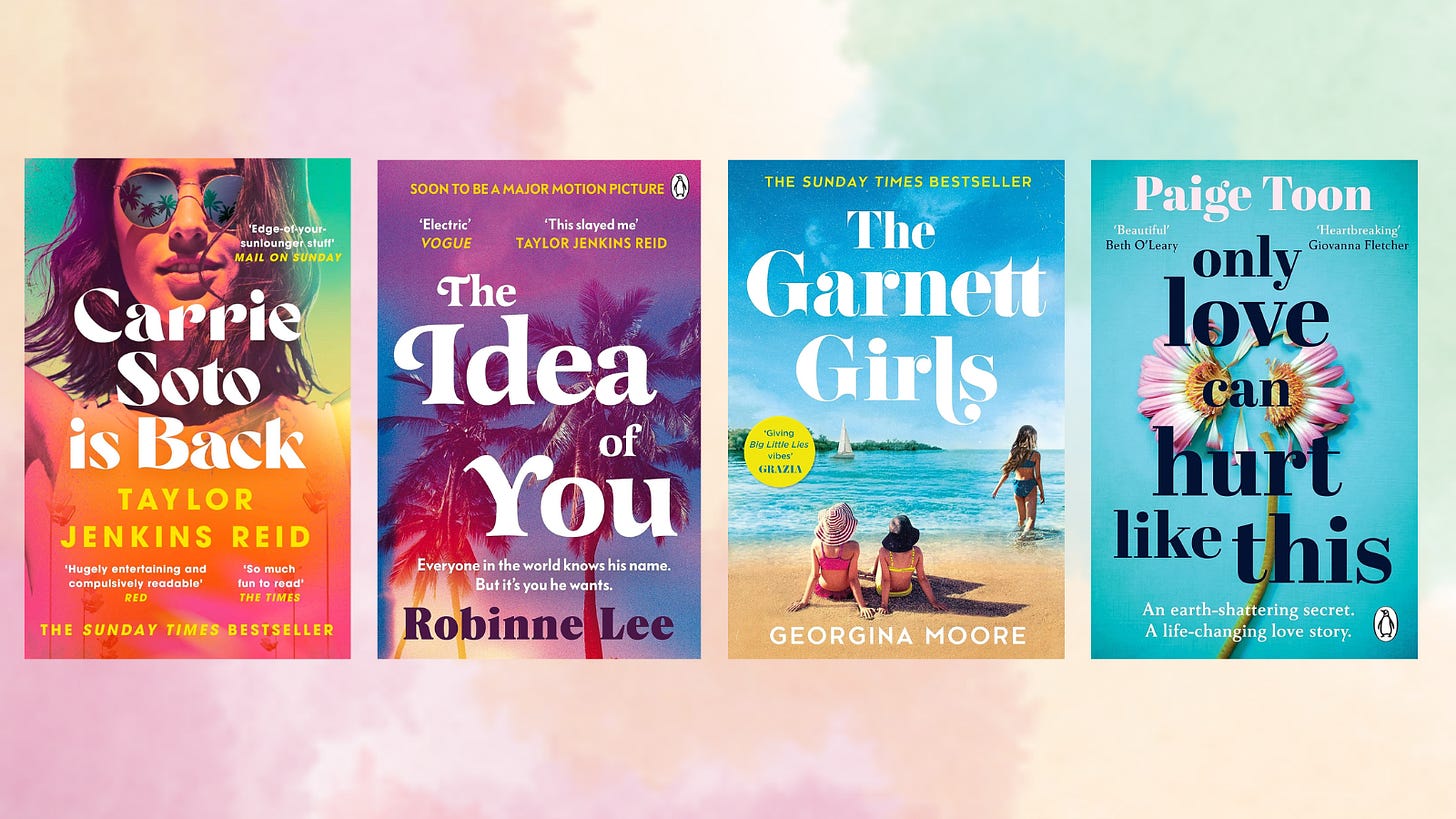
It made me think about other books where the look and feel is similar. I have no ideas which of these came first, but this bookstagram stack shows another group of books that all have an uncanny resemblence to one another.
I loved the top four of these books, but haven’t read the fifth. Seeing it alongside the others makes me think I probably would enjoy it, so have added it to my wishlist.
Why does this happen?
A lot of people hate this practice. It feels lazy and pushy to them - as though they are being tricked into buying something that is inferior to the original. Maybe in some cases that is true, but in most, I would argue that it’s just publishers trying to make their book stand out to the people who are most likely to enjoy it in any way they can.
When a book does well, other authors and publishers want to align themselves with that book. One way to do this quickly is via the cover. It’s shorthand for ‘if you like that, you might like this’.
Here’s another example: Taylor Jenkins Reid now has a clear look and feel for her covers. Suddenly, this font is popping up all over the place! The Idea of You even takes it a step further with a quote from TJR as well.
As a reader, this signalling is EXTREMELY effective on me. I want to read all of those books above, because I love TJR.
Same same for the Greek retellings. These are not quite as obviously connected as the titles above, but I still can tell by looking at them (pottery, female figure, gold foil, line drawing element etc) that they are retellings, and I immediately want to read them all (and actually, I have read 3 out of 4 of these!).
Surely it’s better to be original?
Book covers are an incredible marketing tool because they can immediately convey to a reader what the book is about without them having to pick it up. Making clear visual links between a new book and an existing book is a shorthand way to tell people what the feel of the book is.
People very much do judge books by their covers. And they should!
Let’s look at these three covers with nearly the same title.
CLEARLY these are in entirely different genres, and you can immediately guess which by looking at the covers. Because you have seen other books that look similar to them, you know where to position it in your head as a reader.
So, whilst it is great to have an original concept, you still need to convey what the book is about and make it immediately obvious to readers.
What can you learn from this?
Even if you don’t want to replicate elements of someone else’s cover (in fact, please don’t do that), you should be aware of what’s happening in the wider market within your genre. These trends are great for signalling, but they do change over time.
At some point, a tipping point will be reached, and the market will get saturated by books that look and sound the same, or someone will come out with a new look that people want to be aligned with. When the trend starts out, people think ‘ooh, that book looks like Happy Place, I loved Happy Place, let me give this a go’. When a trend starts to get used by everyone and their mother, it becomes less effective, both for the original author and for any other authors who are using that look.
This is one reason why I always encourage indie authors to hire a book designer - not a graphic designer - to design your cover. Graphic designers are great for all sorts of reasons, but they will not know about the wider context and the cues that make it easier for your reader to understand where your book sits in relation to the books they already read and love.
Even if your book doesn’t actually look the same as the others, as with some of the examples in this post, it shouldn’t look wildly out of place.
If it does, maybe you’re the first in a brand new design trend or - more likely - maybe you need to think about how you signal to the reader what kind of book this is.
Some questions to ask yourself about your cover:
Do the bestsellers in your genre have a recognisable look?
Is there a font-type that is used widely (serif, sans serif, script etc)? Is the text in a bold colour? Upper case?
Do they use a tagline, and if so, what format does it take?
Are there recognisably similar design styles?
Looking at your book’s cover alongside the top 10 other books in this category, does your book look as though it sits comfortably within the genre?
Thoughts and feels on similar covers? Anything come up through asking yourself the questions above?
PS: This is the kind of article I’ll be sharing as part of my paid Substack subscription. If you’re interested in reading more of these, please consider upgrading your account. You’ll get all the articles I write, as well as get access to a monthly Q&A with me AND have the satisfaction of knowing you are helping me to live out my dream of getting paid to write on the internet.


I work in packaging design and I had always thought of book cover “copy cats” as a bit of an Aldi design, we call it a “me-too” (This may not translate if you are not in europe but... basically aldi is a cheap supermarket, copy all the big brands: less quality goods...) so in effect oh it looks like “taylor jenkins reid” but not as good. But actually the more I read your piece I thought these are what we in packaging call category norms. You have to abide by a certain design code to show people what the product is and sometimes these can veer very close to big brands if they are an “original” product eg. Cornflakes where it’s very hard to show what the product is without looking like kelloggs. So basically these codes are helping people understand the kind of writing through a feeling of another author which hopefully will spread the love for them as well as long as they are equally good quality. Really interesting read.
This is super-interesting, thank you Katie. Like you, I use covers to cue whether I'm going to be interested in a book and although I'm sure this means I disregard books that I might otherwise have enjoyed, I'm also time-poor, as are lots of people! My book buying habits have changed over the years and I mostly buy things I've seen reviews of, by people I trust, on social media BUT when I do get to visit a book shop, covers definitely get their chance to work their magic on me! I think its a really effective visual communication tool and not to be sniffed at when trying to reach readers - surely we should use every tool available!